


PT
Fundada em 1977, a Império Materiais de Construção é uma rede de lojas que atua na região dos Vales do Mucuri e Jequitinhonha.
O desafio do projeto era modernizar e dar mais personalidade a identidade visual da marca. Uma conexão com o mundo da arquitetura e engenharia era desejado por conta do histórico de relacionamentos da empresa e da nova estratégia de negócios.
Resultado, o novo símbolo da Império, também se tornou um produto.
EN
Founded in 1977, Império Materials de Construção is a chain of stores that operates in the Mucuri and Jequitinhonha Valleys region.
The challenge of the project was to modernize and give more personality to the brand's visual identity. A connection with the world of architecture and engineering was desired due to the company's history of relationships and new business strategy.
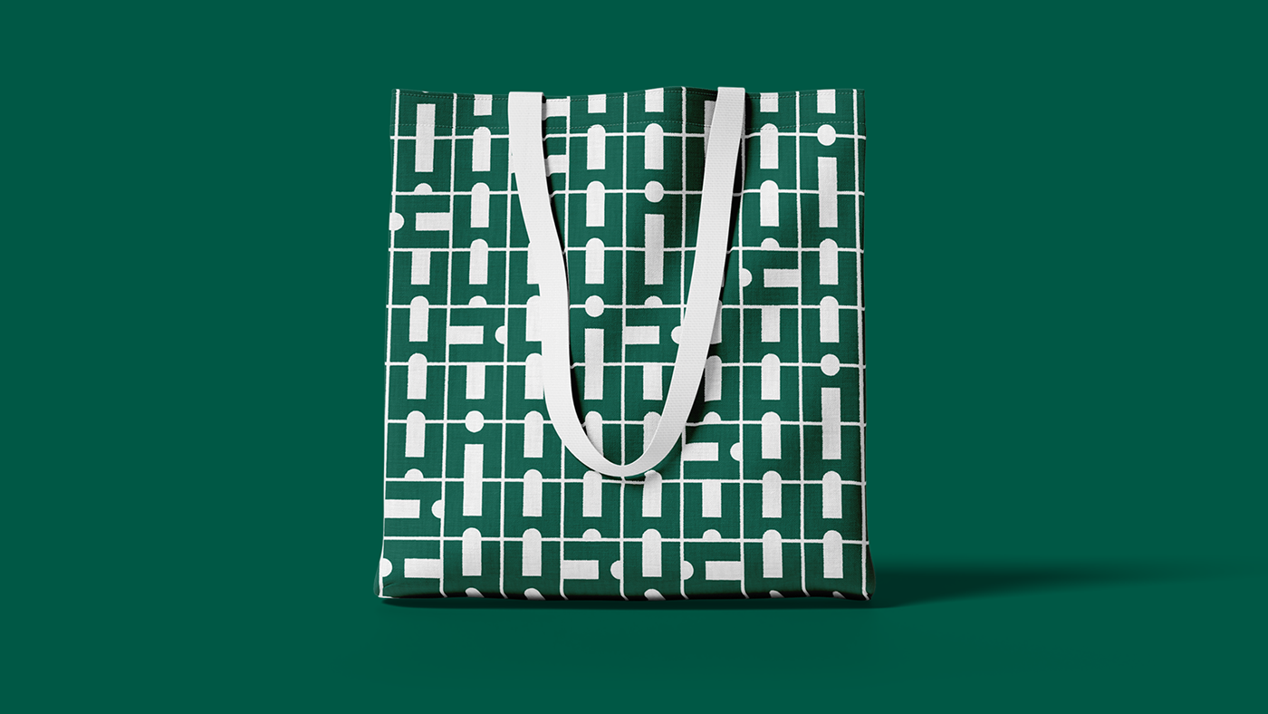
As a result, the new symbol of Império also became a product.


PT
Com mais de 50 anos de mercado e diversas identidade visuais, a logo vigente já estava em uso a mais de 15 anos e seu símbolo permitia duas interpretações: uma casa vista de frente e uma mercearia em perspectiva. Em nenhuma das leituras, o símbolo representava bem a empresa ou fazia qualquer associação ao nome.
"Havia um vazio entre o nome e a identidade visual.”
Compreender esse problema foi crítico para a decisão de buscar uma conexão semântica com objetivo de aumentar a capacidade de sedimentação, associação e chance de lembrança.
A solução traz camadas de compreensão que podem ser lidas de uma só vez, ou em momentos distintos. Brincando com o leitor, ao “esconder” a letra i na contraforma, criando semelhança com ícone de reino e transformando o símbolo em azulejo, a nova identidade visual da império trouxe propriedade a marca.
EN
With more than 50 years on the market and different visual identities, the current logo had already been in use for more than 15 years and its symbol allowed two interpretations: a house seen from the front and a grocery store in perspective. In none of the readings, the symbol represented the company well or made any association with the name.
“There was a huge gap between the name and the visual identity.”
Understanding this problem was critical for the decision to seek a semantic connection with the aim of increasing the sedimentation capacity, association and chance of remembering.
The solution brings layers of understanding that can be read at once, or at different times. Playing with the reader, by “hiding” the letter i in the counterform, creating a similarity with a kingdom icon and transforming the symbol into a tile, the new visual identity of Império brought ownership to the brand.

PT
Algumas descobertas na fase de pesquisa e estratégia se conectaram de forma visceral com a solução gráfica:
• O primeiro nome foi Império dos Azulejos.
• A primeira logo tinha o nome pintado e o símbolo era um azulejo português real (na placa bandeira).
• A primeira logo tinha o nome pintado e o símbolo era um azulejo português real (na placa bandeira).
• O fundador, Seu Tim, na busca por inovação, comprava azulejos brancos e ia de carro de Teófilo Otoni até
Belo Horizonte, para que um artista plástico pintasse um a um.
• A ideia do azulejo ser um elemento visual da marca soou muito bem para o momento do negócio que passava
a investir mais produtos de fase final de obra, dentre eles, pisos e azulejos.
• Nenhum concorrente direto utiliza a cor verde, em algumas situações a marca era lembrada como aquela loja
de material de construção verde.
• Até hoje é reconhecida como antiga Império dos Azulejos por vários clientes.
EN
Some discoveries in the research and strategy phase connected in a visceral way with the graphic solution:
• The first name was Império dos Azulejos.
• The first logo had the name painted and the symbol was a real Portuguese tile (on the flag plate).
• The founder, Mr. Tim, in the search for innovation, bought white tiles and drove from Teófilo Otoni to Belo
• The first name was Império dos Azulejos.
• The first logo had the name painted and the symbol was a real Portuguese tile (on the flag plate).
• The founder, Mr. Tim, in the search for innovation, bought white tiles and drove from Teófilo Otoni to Belo
Horizonte, so that an artist could paint them one by one.
• The idea of tiles being a visual element of the brand sounded very good for the business at a time when it was
• The idea of tiles being a visual element of the brand sounded very good for the business at a time when it was
investing more in final-stage products, including flooring and tiles.
• No direct competitor uses the color green, in some situations the brand was remembered as that green
building materials store.
• To this day, it is recognized as the former Azulejo Empire by several clients.


PT
O redesign da identidade visual da Império, trouxe uma releitura de um símbolo antigo da marca. Com a definição de objetivos, pesquisa de mercado e análise de concorrência, descobrimos o que manter (cor), o que perder (generalíssimo) e o que somar (propriedade) no visual da marca.
Estrategicamente, atualizamos os tons de verde (cor principal) da paleta de cores e adicionamos o amarelo ouro para o símbolo. Acompanhando a transformação, desenvolvemos o logotipo com a fonte Eurostile Extended da fundição URW Type e garantimos elegância e alta leiturabilidade personalizando sutilmente alguns caracteres e ajustando o kerning. Para a fonte de apoio, a FF Good Headline por Łukasz Dziedzic e sua ampla família complementaram a identidade visual da marca garantindo consistência.
Com interseção nítida entre o design gráfico e a azulejaria, os desdobramentos da identidade visual foram de encontro com a estratégia de marca de se comunicar melhor com arquitetos, designers de interiores, engenheiros e interessados na construção civil de certa forma.
EN
The redesign of Império's visual identity brought a reinterpretation of an old symbol of the brand. By defining objectives, market research and competition analysis, we discover what to keep (color), what to lose (generalissimo) and what to add (property) to the brand's look.
Strategically, we updated the green tones (main color) of the color palette and added golden yellow to the symbol. Accompanying the transformation, we developed it with the Eurostile Extended font from the URW Type Foundry and guaranteed elegance and high readability, subtly customizing some characters and adjusting the kerning. For the source of support, the FF Good Headline by Łukasz Dziedzic and his extended family have complemented the brand's visual identity ensuring consistency.
With a clear intersection between graphic design and tiles, the developments of the visual identity were in line with the brand's strategy of communicating better with architects, interior designers, engineers and those interested in civil construction in a certain way.


